Fintech · BNPL · 2021–2022
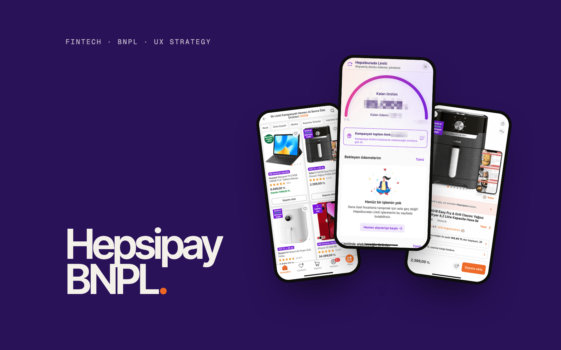
Hepsipay BNPL.
UX strategy for a buy now, pay later experience embedded in Hepsiburada’s digital wallet, from discovery to design principles and cross-functional alignment.
- Role
- UX Strategist
- Timeline
- 2021 – 2022
- Team
- Product, finance, risk & compliance, engineering and leadership
- Platform
- Hepsipay wallet inside Hepsiburada checkout
Responsibilities
- UX strategy
- Product discovery
- Competitive benchmarking
- Workshop facilitation
- Customer journey mapping
- Design principles
- Cross-functional alignment
(01) — Context
Context.
Access, not intent.
Hepsiburada, one of Turkey’s largest e-commerce platforms, saw that many shoppers who wanted to buy were held back by access rather than intent. Credit card limits were maxed, bank processes were slow, and people without a card had no path to purchase at all.
The opportunity was a buy now, pay later experience built into Hepsipay, Hepsiburada’s digital wallet. I joined as UX Strategist to lead the experience strategy end-to-end.
My role & contributions
- Led the UX strategy from first principles.
- Ran product discovery and synthesised customer and market insight.
- Benchmarked leading global BNPL experiences to inform design direction.
- Facilitated cross-functional workshops to align on scope and customer value.
- Produced the UX strategy framework that guided downstream UI decisions.
- Created journey maps, design principles and strategy documentation.
(02) — The problem
The problem.
A taksit culture with a trust problem.
Instalment purchasing, taksit, is part of everyday commerce in Turkey. Yet many people are underserved by credit cards, and the opacity of banking creates friction and distrust at exactly the moment a purchase decision is made.
Experience challenges
01
No fallback at checkout
Shoppers whose card limit was reached had no other way to pay.
02
Financial exclusion
People without a credit card, or without a bank account, had no path to purchase.
03
Responsible borrowing
Easy credit carries real risk of over-borrowing: a UX challenge as much as a policy one.
04
Trust deficit in credit
People associated credit with hidden costs and opaque terms.
05
Setting a standard
An embedded BNPL had to feel clear and safe from the very first purchase.
(03) — Discovery
Discovery.
What users needed. What the market did.
Discovery ran on two tracks: understanding customers’ needs around paying and borrowing, and benchmarking how leading BNPL products handle the same moments. Both fed directly into the UX strategy framework.
Insight themes
Insight 01
Budget flexibility > price
People didn’t want cheaper products; they wanted to preserve cash flow and credit headroom. BNPL’s value is flexibility over time, not a discount, and that shaped how the experience communicates.
Insight 02
Trust as table stakes
Any unclear fee or ambiguous term would make people walk away. Transparency was not a feature; it was a prerequisite.
Competitive benchmarking
I compared leading global BNPL experiences across five UX dimensions: onboarding friction, repayment clarity, checkout integration, post-purchase communication and trust signalling.
The takeaway: BNPL products are similar at their core. The difference is the experience: how quickly someone understands the total cost, the repayment schedule, and what happens if they miss a payment.
“BNPL is fundamentally a cash-flow management tool, not a credit product.”
(04) — Strategy
Strategy.
Four pillars, four tensions.
The UX strategy was organised around four pillars, each resolving a tension in the product: inclusion vs. risk, speed vs. trust, transparency vs. simplicity, and purchasing power vs. financial health. Decisions across onboarding, checkout and repayment map back to one of them.
#1
Inclusive by design
No second-class experience for people without credit cards.
- One-time verification
- Payment date reminders
- Partial payment
- Multiple ways to pay back
#2
Budget control
BNPL as a financial wellness tool, not a debt spiral.
- Predefined limits
- Option to pay early
- Budget visibility
- Repayment calculation
#3
Purchasing power
Restore confidence and capability at the moment of purchase.
- No hidden costs
- Fast checkout
- Basket kept during verification
- Clear limit conditions
#4
Building trust
Every touchpoint reinforces the safety of the ecosystem.
- No hidden fees
- Transparent late-payment policy
- Clear terms
- Cancellation rights
Responsible fintech UX principles I established
- Total cost must be visible before any commitment.
- The repayment schedule must be scannable at a glance: dates, amounts, nothing hidden.
- Rejection must be explained, with a way to qualify.
- No consent bundling: each permission is a separate, explicit action.
- Verify once. Returning users shouldn’t re-verify without a reason.
- Friction is asymmetric: front-load trust signals, back-load verification.
- Key decision
Delivery model: a customer-experience question, not only a business one
Evaluating how to bring BNPL to market meant balancing speed to market, customer experience continuity and long-term product control. I framed the customer side for stakeholders: the experience should stay inside the familiar wallet and checkout, so customers never feel handed off to a third party.
(05) — Alignment
Alignment.
UX at the strategy table, not only the delivery table.
UX didn’t sit downstream of product decisions here. I facilitated cross-functional workshops that brought product, finance, risk & compliance, engineering and leadership onto the same strategic frame: shared language first, then scope, customer value and competitive positioning.
Shared language
A glossary before any feature discussion.
In fintech, misaligned terms between finance, legal, engineering and design cause rework. Agreeing on what words like ‘limit’ and ‘instalment’ mean came before any feature discussion.
Reframing
UX as risk mitigation.
Clear repayment terms and transparent rejection aren’t only good UX; they also serve compliance and responsible lending. Framing design decisions this way gave design a seat at the strategy table.
(06) — Journey
Journey.
Three scenarios, one checkout.
I mapped three scenarios that shaped the design decisions: a new user meeting BNPL for the first time at checkout, an existing wallet user with an active limit, and someone checking their available limit before shopping. Each had different trust thresholds, friction tolerance and information needs.
Core checkout journey · new user
- 01
Cart
Product selected
- 02
Payment method
BNPL offered at checkout
- 03
Verification
One-time, digital
- 04
Credit decision
Instant
- 05
Plan selection
Repayment options
- 06
Confirmation
Order complete
- 01
BNPL at checkout, not before
BNPL appears at the payment step, not while browsing. Introducing credit earlier risked normalising debt for impulse purchases.
- 02
Verify once
Returning customers shouldn’t have to repeat verification on every purchase.
- 03
Repayment plan before commitment
Dates, amounts and fees are shown before a plan is selected, not after. Good UX, and responsible lending practice.
- 04
Rejection with a path forward
People who aren’t approved get a clear explanation and a way to qualify later, so a ‘no’ doesn’t break trust in the brand.
Scenario coverage
Scenario 1
New user
Verification → credit decision → plan selection, designed to feel like consumer app onboarding rather than a bank loan application.
Scenarios 2 & 3
Returning users
Users with an existing limit skip verification, and can check their available limit from the wallet before shopping.
(07) — Screens
Screens.
From product page to wallet.
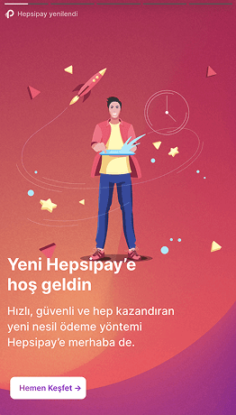
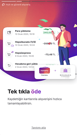
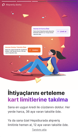
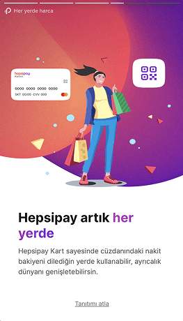
Buy now, pay later in the released Hepsipay app: offers on the product, then the limit, its remaining balance and payments inside the wallet. Personal and account details are masked.
01Product listing
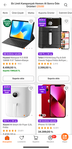
Pay-later and instalment badges on each product.
02Product page
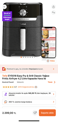
The pay-later offer shown with the price.
03Wallet home
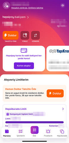
Shopping limits visible from the wallet, before shopping.
04Shopping limits
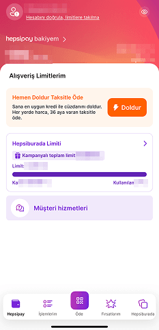
Limit, remaining and used amounts on one card.
05Hepsiburada Limiti
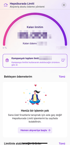
Remaining limit, pending payments and eligible products.

(08) — Contribution
Contribution.
What the strategy work left behind.
The UX strategy framework guided the design direction and served as a shared reference for product, engineering and finance as the experience moved into delivery.
A trust model for the experience
Principles for cost transparency, explicit consent and explained rejection, written down so every team could design against them.
Shared understanding early
Workshops created clarity on scope, responsibilities and user goals before delivery started.
Journeys for every entry point
New users, returning users and limit checks mapped end to end, each with its own trust and friction needs.
Benchmarks turned into direction
Market patterns translated into concrete decisions about where to place cost, schedule and consent.
(09) — Reflection
Reflection.
Alignment is the product.
“The benchmark, the glossary session, the workshops: none of these produced screens. All of them produced alignment.”
The most valuable lesson was reframing UX work as organisational infrastructure, not outputs. In a fintech environment where one miscommunicated term can create compliance risk, that alignment is the product.
Responsible design in lending isn’t about adding friction. It’s about placing the right information at the right moment: before commitment, not buried in terms. The trust built by transparent design is worth more long-term than the short-term conversion gained by hiding fees.