Product Design / Mobile App / AI-assisted Development · 2026
Room.
From product concept to a working reading community app.
- Role
- Independent Product Designer & AI-assisted Developer
- Platform
- iOS-first mobile app · React Native + Expo
- Stack
- Expo Router · TypeScript · Firebase Auth & Firestore · Google Books API
- Status
- In development · not launched · no public users yet
(01) — The Idea
The Idea.
Useful alone, worth coming back to.
“Books make Room useful alone. Rooms make it worth coming back to.”
Core product principle
Problem
Reading tools tend to pick a side: a private log, or a social feed. Room treats tracking your own reading and reading together as one product, with neither allowed to become the secondary feature.
Audience
Readers who treat books as culture rather than a productivity metric. The product voice is deliberately bold, editorial and Berlin-shaped, with a feminist and queer cultural sensibility.
Pillar
Books
Personal reading management: search, wishlist, reading now with page check-ins, and a finished library.
- Wishlist
- Reading now
- Library
Pillar
Rooms
Social reading: public book clubs, private rooms with friends, chat with replies, reactions, page context and spoilers, and reading challenges.
- Public
- Private
- Challenges
Product principles
- 01
Equal pillars
Rooms is never secondary to Books, visually on Home or structurally in the tab bar.
- 02
Value before sign-up
Guests can browse Home, Books, search and public Rooms. Sign-up is asked for only at a meaningful action.
- 03
Editorial, not SaaS
Bold, high-contrast, poster-like. Playful but not childish. Never soft pink, never a dashboard.
- 04
No pressure mechanics
No leaderboards and no streak shame. Challenges invite; they don't rank.
- 05
Safety is core
Report, block and moderation flows ship with the MVP, not after it.
MVP decisions
- Four tabs, nothing more
- HOME · BOOKS · ROOMS · PROFILE. The open question of a centre “+” tab was resolved by not building it.
- Mock data before backend for Rooms
- Navigation and IA were fixed on in-memory data first; real persistence comes next, on an existing data model.
- Google Books, not a catalogue
- Usable without authentication at MVP scale, with an honest offline fallback.
- Firebase over Supabase
- Auth and Firestore for the native rebuild; the legacy prototype’s Supabase proof of concept was dropped.
- Two books at a time
- Reading now is capped at two concurrent books to keep the reading state clear.
(02) — Inside Room
Inside Room.
The app, as built.
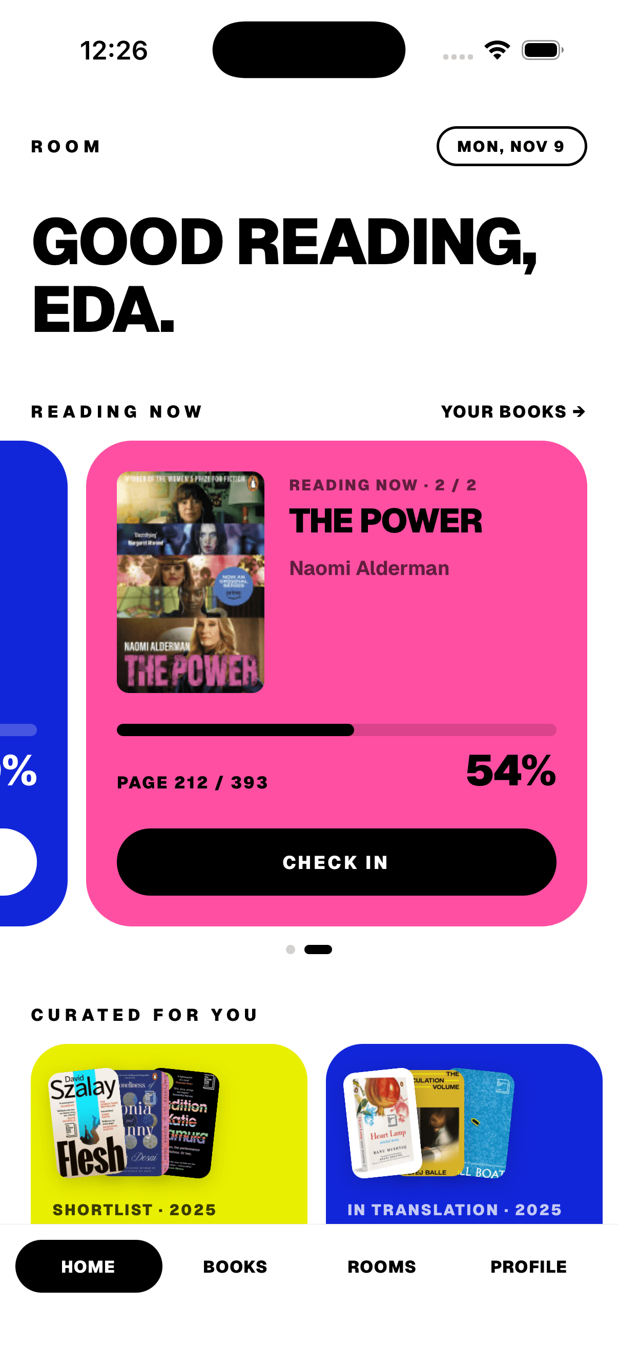
01 · Home
Two pillars on one screen
Home opens with a personal greeting, the books you’re reading now, and curated lists, with Rooms given the same visual weight.
- Reading Now carousel with progress
- Curated lists for discovery
- Check in without leaving Home
Implemented
01 · Home
Two pillars on one screen
Home opens with a personal greeting, the books you’re reading now, and curated lists, with Rooms given the same visual weight.
- Reading Now carousel with progress
- Curated lists for discovery
- Check in without leaving Home
Implemented
(03) — Design Decisions
Design Decisions.
From the UX/IA audit, as implemented.
- 01
Ask for an account only when it matters
- Problem
Forcing sign-up at launch asks for commitment before people understand the product. Gating each screen ad hoc risks inconsistent behaviour and lost intent.
- Decision
One AuthGateProvider gates every meaningful write or social action. Guests can browse Home, Books, search, public Rooms and a room preview.
- Rationale
The pending action is held as a closure and resumed after sign-in, so you land back where you were with the action done, not on Home.
- Iteration
Auth screens call consumePendingAction() and go back. It is the only sanctioned gating mechanism; no screen builds its own.
- Problem
- 02
Make the destructive path harder to reach
- Problem
Audit finding: Sign Out and Delete Account sat at the same level with comparable visual weight.
- Decision
Sign out is neutral black at the Settings root, with a calm confirm. Delete Account moved into Account & Profile’s Danger Zone, with a hot-pink final confirmation.
- Rationale
A safety decision, not polish: the irreversible action should take more deliberate steps than the safe one.
- Problem
- 03
Give Create Room a full screen
- Problem
A three-step wizard with book search and a people picker was cramped inside a centred modal.
- Decision
Create Room became a full-screen route with clear step progress.
- Iteration
Success shows a toast and replaces the flow with the new Room Detail. No intermediate screens.
- Problem
- 04
A check-in that actually checks in
- Problem
The Home “check-in” call to action only navigated to Books. The copy promised something the button didn’t do.
- Decision
It now opens the real check-in modal, or a two-book chooser, reusing the same progress logic as Book Detail.
- Problem
- 05
Four tabs and a navigation rule
- Exploration
The migration plan left a centre “+” tab open as a possible global create launcher.
- Decision
Not built. Create actions live in context: header buttons and empty states.
- Rationale
A fixed invariant: tab = top-level hub, card = detail, back = previous context.
- Exploration
- 06
Search failures that don’t lie
- Problem
A flaky connection shouldn’t leave a dead search, but an outage mustn’t look like “no results” either.
- Decision
Debounced Google Books search with an offline fallback, kept distinct from genuine zero results and rate limits.
- Iteration
The mapper and service are covered by unit tests.
- Problem
(04) — UI System
UI System.
Rebuilt live from the app’s own tokens.
Everything below is an interactive web rebuild of Room’s real design tokens and components, with values copied from src/design/tokens.ts, typography.ts and the component source, and copy quoted from the app. It isn’t a screenshot.
Colour · src/design/tokens.ts
Type · Geist 600 / 700 / 900 · src/design/typography.ts
- heroHeadline · 42/44 · -1.2Good reading
- sectionHeadline · 30/32 · -0.8Your rooms
- body · 14/19 · 0Reading women who make bad decisions in beautiful prose.
- buttonLabel · 12/16 · 1.5Check in
- eyebrow · 11/14 · 3Reading now
- segmentLabel · 11/14 · 0.6Wishlist · Library
- pillLabel · 10/13 · 1Private room
Radii · card 30 · compact 20 · pill 999
Spacing · xs 4 → xl 32
- xs4
- sm8
- md12
- lg20
- xl32
Components · interactive
Tab bar · BottomNav
Exactly four tabs. Try it: the active pill follows your choice.
Buttons and badges
Confirm dialog · one component, two intents
Account
Sign out?
You can sign back in any time with the same email and password.
Reading Now + check-in · drag the page, then check in
Reading now · 2 / 2
The Power
Naomi Alderman
(05) — Designed and Built with AI
Designed and Built with AI.
Human judgement, AI-assisted implementation.
What I owned
- Product vision, the two-pillar principle and the design direction
- Information architecture and the fixed navigation invariant
- The UX/IA audit, approved before any refactor code was written
- Scope boundaries, e.g. no Rooms backend during the IA refactor
- Every copy or IA change flagged explicitly, never changed silently
- Standing guardrails: legacy repo is read-only; ask when a decision is mine
Where AI implemented
- Migrating the Next.js prototype to React Native + Expo, screen by screen
- Implementing each approved slice of the IA refactor
- Writing Firestore security rules and their emulator test suite
- Google Books mapping and service code, with unit tests
- A Figma UX map of the current app, built through the Figma MCP server
How every change was made
- 01
Inspect
Read the relevant source before proposing anything
- 02
State the change
Say what will change, and why, before touching code
- 03
Smallest slice
Implement one coherent piece at a time
- 04
Typecheck
npx tsc --noEmit must be clean
- 05
Bundle
npx expo export --platform ios to validate the build
- 06
Test
npm run test:mapper · npm run test:rules
- 07
Report
Summarise what changed before the next slice
Every slice of the IA refactor (auth gate, Settings, Books gating, Create Room, Home) passed the typecheck before the next one started.
Architecture
What is real today, and what is deliberately still mock data.
- Expo 57
- React Native 0.86
- React 19.2
- TypeScript 6.0
- Firebase 12
- Geist
- RoutesExpo Router, file-based · 4 tabs + full-screen stacks, modals, sheets
- StateReact Context: Books, Rooms, Social, AuthGate, TabBarVisibility · No Redux, by decision
- Servicesauth · profile · books · library · account
- FirebaseAuth (email/password) · Firestore: profiles, users, usernames, books, library · Security rules + emulator tests
- ExternalGoogle Books API with offline fallback
- Mock, by designRooms, messages, reactions, challenges · Follows, blocks, reports
Real challenges
A migration, not a redesign
The web prototype’s visual language, IA and behaviour carried over to native on purpose. Improvements were made consciously and flagged.
Resuming intent through auth
Gated actions close over live data that can’t be serialised into a route param, so the pending action is held in a ref and replayed after sign-in.
Rules you can trust
Real Firestore data is protected by security rules with an emulator test suite, not by convention.
Knowing when to stop
The Figma UX map paused at a rate limit, half built. Recorded honestly as an open deliverable rather than faked complete.
(06) — Reflection & Next
Reflection & Next.
What’s done, what’s mocked, what’s next.
Built and working
- Firebase Auth with a central deferred-auth gate
- Profiles and unique usernames
- Books library synced per user: wishlist, reading, finished
- Live Google Books search with offline fallback
- Settings IA: five categories, neutral sign-out, Danger Zone
- Legal and safety UI scaffolding
UI complete · mock data
- Rooms and memberships
- Chat, replies and reactions
- Reading challenges
- Follows, blocks and reports
In development next
- Rooms persistence on the existing Firestore data model
- Invitations, activity feed, push notifications
- Backends for data export and account deletion
- Legal launch blockers: operator identity, processor agreement, accessibility audit
- Finish the Figma UX map
Sequencing is a design decision
Fixing navigation and IA on mock data before building persistence means the backend will be shaped by a structure I already trust.
AI moved the code; judgement stayed mine
Implementation got fast. The real work was the audit, the scope boundaries, and stopping to decide when a choice was a product decision.